 EN

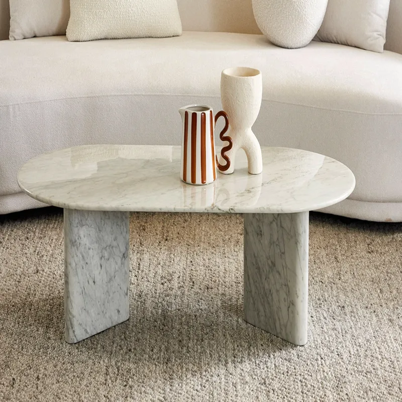
Material Contrast: Why Non-Marble Elements Elevate Marble Table Styling
Pairing Warm Metals (Brass, Bronze) for Visual Balance
Marble’s cool, hard surface gains inviting warmth when paired with golden-toned metals like brass and bronze. Their subtle amber or honeyed gleam balances crisp white or grey veining—softly absorbing and reflecting light unlike stark chrome, which can amplify an icy aesthetic. A heavy bronze sculpture makes a confident anchor on a side marble table, while slender brass candlesticks or a delicate tray rim add refined elegance to a dining marble table without overwhelming the stone. This interplay works because the metal’s warm undertone harmonizes with marble’s crystalline structure. Professional stylists recommend grouping small metallic accents in threes for a curated, intentional look. Avoid oversized polished brass sheets that compete for attention; instead, choose unlacquered finishes that develop a rich, evolving patina—deepening the connection between these luxurious materials and reinforcing a balanced, welcoming atmosphere.
Introducing Textured Natural Materials (Wood, Linen, Ceramics)
Organic textures dissolve the formality of marble and ground the composition. Wood introduces grain and warmth that echo marble’s veining—yet in a wholly different, tactile language. A live-edge wooden fruit bowl or set of oak coasters softens the stone’s polished edge. Linen, with its subtle slubs and matte surface, absorbs light rather than reflecting it—ideal as a runner or placemat for quiet, textural contrast. Ceramics—especially hand-thrown, unglazed pieces—bring earthy, imperfect shapes that feel human and artisanal. A cluster of matte ceramic vases in soft neutrals (beige, cream, charcoal) bridges the gap between the cold marble surface and the room’s softer textiles. This deliberate mix of rough and smooth—achieved without introducing color chaos—invites touch and lends the tabletop a storied, lived-in presence rather than sterile perfection.
Color Strategy: Selecting Complementary Hues for Marble Table Decor
Neutral Palettes That Accentuate Veining Without Competition
Whites, creams, soft grays, and matte black form a timeless backdrop that lets marble’s natural veining command attention. According to the International Surface Fabricators Association’s 2022 report, 68% of homeowners choose neutral décor specifically to avoid visual conflict with stone patterns. Steer clear of bright, cool whites that flatten lighter marble tones—instead, layer linen runners or matte ceramic dinnerware in warm ivory. Beige undertones bridge cool and warm veins, creating harmony. Subtle texture from unglazed pottery or nubby placemats adds depth without distraction. For wall art, choose black-and-white photography or abstract pieces with earthy tones. A temple-glass vase in taupe or slate anchors the tablescape, ensuring the marble’s natural flow remains the focal point. Restricting the palette to monochrome or low-contrast tones respects the stone’s complexity and sustains a serene, cohesive aesthetic.
Strategic Pops of Color: When and How to Use Bold Accents
A single, well-placed bold accent—like a cobalt blue platter or amber glass votives—can lift a marble table from quiet to striking. Reserve vibrant hues for easily swapped seasonal elements: napkins, floral arrangements, or decorative bowls. Warm terracotta or mustard creates a lively counterpoint to cool-toned marble without overwhelming it. Limit the bold element to one intentional piece—a sculptural red centerpiece, for example—and keep nearby surfaces neutral so the splash feels purposeful, not chaotic. As noted in Home Accents Today’s 2024 trends report, 42% of professional decorators now use high-impact accents on stone tables to inject personality. Because these accents are temporary, the marble’s veining effortlessly reclaims center stage when they’re removed—keeping the space dynamic, adaptable, and elegantly grounded.
Proportion & Placement: Scaling Decor to Marble Table Dimensions and Room Function
A marble table naturally commands visual attention due to its material weight and often generous dimensions. Getting proportion right means treating the tabletop not as a blank canvas to fill—but as a stage where each decorative element earns its place. The fundamental rule is counterintuitive: fewer, larger pieces consistently outperform many small ones. Scale mismatches—such as a tiny bud vase on a sprawling 10-seat dining slab—fragment the composition and undermine the table’s presence. The goal is to create a layered, cohesive vignette that respects the marble surface while reinforcing the room’s function.
Dining Table vs. Console or Side Table: Height, Density, and Visual Weight Guidelines
Decoration strategy shifts sharply based on the table’s role. For a dining table, sightlines are paramount. Centerpieces should stay below 30 cm (12 inches) or be visually permeable—think wide, low bowls or airy branch arrangements—so guests can converse unimpeded. A dense, opaque block of décor creates a visual wall. Visual weight matters too: a cluster of heavy ceramic vessels on a delicate marble table adds tension, while a solid bronze candelabra anchors a thick, robust top. Function must never be compromised—leave at least 40 cm (16 inches) of clear surface per place setting.
Console and side tables call for deliberate asymmetry. Here, height becomes an asset—a tall lamp or substantial vase draws the eye upward, balancing the table’s low, elongated form. Layer items in odd numbers, varying heights: a stack of art books, a sculptural object, a vertical accent. Density is dictated by context: a narrow entry console against a wall can support a tighter, more curated grouping than a floating side table, which needs breathing room on all sides. Always step back and assess whether the arrangement supports traffic flow—if you must sidestep a decorative object, the placement needs recalibration.
FAQ
What materials pair best with marble for balance?
Warm metals like brass and bronze, textured natural materials such as wood, linen, and ceramics, and strategic pops of color in small, intentional elements work wonderfully for balancing marble.
How can I avoid overwhelming the veining of a marble table?
Stick to neutral decor such as whites, creams, soft grays, and matte blacks. Avoid bright whites, and focus on textures that highlight, not compete with, the stone.
What proportion rules should I follow when styling a marble table?
Fewer, larger pieces work better than many small ones. Additionally, consider the table's role: dining tables require low or visually permeable centerpieces, while console tables benefit from asymmetry and height variations.
Can bold colors be used on marble tables?
Yes! Opt for one well-placed vibrantly colored accent. This should be easily removable to maintain the adaptability and timeless look of your table.