 EN

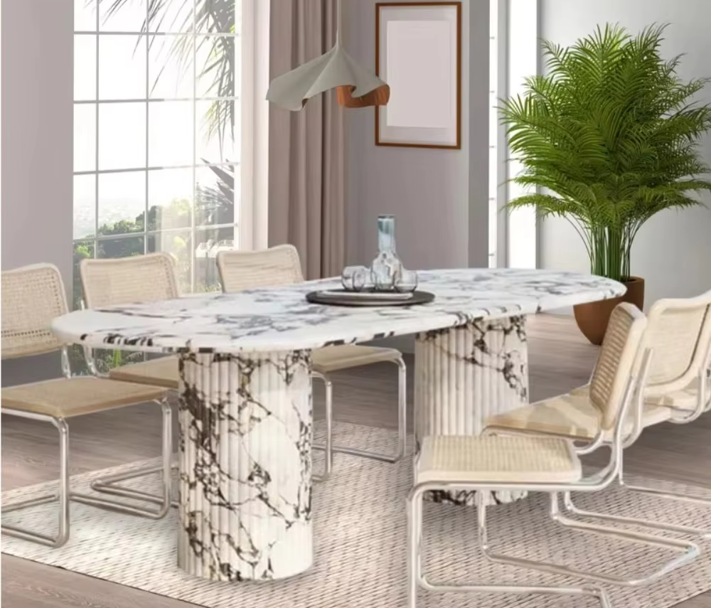
Calacatta Viola’s Signature Visual Drama: Purple Veining and Spatial Impact
How High-Contrast Purple-Gray Veining Creates Movement, Depth, and Focal Energy
Calacatta Viola’s defining feature is its bold, high-contrast veining—deep purple and violet-gray strokes sweeping across a luminous milky white background. Unlike the soft grey lines of standard Carrara, this dramatic interplay creates an immediate focal point, anchoring any space with organic energy no paint or finish can replicate. The veins guide the eye across the surface, generating visual movement that transforms flat planes into layered, dimensional landscapes. From a design psychology standpoint, the contrast between light base and saturated dark veins establishes visual weight and spatial hierarchy—elevating the material itself as the room’s primary architectural statement. In minimalist settings, a single Viola slab becomes the sole artwork; its intrinsic pattern proves that materiality, not ornamentation, delivers the most resonant luxury. Industry data shows natural stone slab imports for decorative applications rose 15% year-over-year (Natural Stone Institute, 2023), reflecting growing demand for high-character surfaces whose emotional impact—shifting a space from serene to commanding—is rooted in the intensity and saturation of their veining.
Using Veining Direction and Density to Enhance Architecture: Elevating Ceilings and Expanding Narrow Spaces
The direction and density of Calacatta Viola’s veining are powerful tools for reshaping perception—making ceilings appear higher, walls recede, or compact zones feel grander. Vertical book-matching—where two mirror-image slabs align to create a continuous upward sweep—guides the eye skyward, adding monumentality to low-ceilinged spaces like powder rooms or city apartment entries. In contrast, horizontal veining on an island slab in a narrow galley kitchen visually pushes the walls outward, enhancing width and grounding the layout. Density further refines this effect: heavily veined sections command attention and define functional zones—such as the cooking area behind a range—while sparser areas maintain calm. This intentional contrast between luminous base and directional dark lines redefines space structurally—not just optically. By aligning veins to converge vertically, even an eight-foot wall gains the gravitas of a grand lobby, confirming that surface design is, at its core, architectural illusion.
Calacatta Viola as a Strategic Focal Point in Key Interior Zones
Bathrooms: Vanities, Shower Walls, and Freestanding Tubs as Sculptural Statements
In bathrooms, Calacatta Viola transcends utility to become immersive architecture. Its luminous white field and dynamic purple veining act as a built-in art installation. A slab-clad vanity serves as an instant sculptural anchor—the pattern draws focus before any fixture is installed. On shower walls, the stone’s fluid motion enlivens the space, turning function into narrative. Book-matched cladding around a freestanding tub creates a pedestal effect, elevating it to the room’s central sculptural element. Bathrooms featuring statement natural stone achieve a 25% higher impression score (2024 industry analysis), thanks to the material’s ability to organize visual hierarchy and let secondary elements recede. Cool undertones harmonize with matte black fixtures and warm metals, while ambient lighting coaxes subtle warmth from the violet veins—delivering a spa-like balance of drama and serenity.
Kitchens and Bars: Full-Slab Backsplashes and Island Tops That Anchor Modern Luxury
In open-plan kitchens and bars, Calacatta Viola functions as an architectural centerpiece. A full-slab backsplash behind the range or bar forms an uninterrupted mural of swirling purple and ivory—eliminating grout lines and delivering a sleek, gallery-worthy finish. An oversized island topped in the same stone grounds the layout; its bold pattern becomes the gravitational center that furniture, lighting, and circulation orbit. Kitchens with a signature stone island see a 15% increase in showing engagement (2023 design market survey). Its reflective surface bounces light, enhancing perceived volume—even in compact footprints. Pairing the backsplash with dark oak shelving sharpens the marble’s luminosity, while a waterfall edge at a bar counter transforms a simple surface into a sophisticated, sculptural moment. Strategic placement on key elements—never overuse—maximizes impact without visual clutter.
Architectural Expression: Calacatta Viola Beyond Surfaces
Calacatta Viola’s expressive power extends beyond countertops and walls into fully three-dimensional architecture. Its luminous white field and violet-grey venation now shape monolithic forms—from fireplace volumes and integrated seating to cylindrical column wraps—that redefine interior space. Uninterrupted veining flows seamlessly across complex geometries, making a 12-foot feature wall appear alive and breathing. This approach revives a historic tradition: book-matched statuary marble was long used to elevate structural piers into art objects—a practice documented by the Building Stone Institute (2022). When a breakfast bar is carved from a single, dramatic block, it ceases to be merely functional and becomes functional sculpture—a silent, commanding anchor for the entire design scheme.
Curating Moody Glamour: Complementary Materials That Elevate Calacatta Viola’s Purple Undertones
Patinated Brass, Limewashed Plaster, and Warm Walnut—Harmonizing Tone and Texture
To amplify Calacatta Viola’s purple-grey drama without overwhelming, pair it with materials that share quiet depth and tactile richness. Unlacquered brass develops a mottled, evolving patina—its muted gleam echoing the stone’s cool, organic character. Limewashed plaster walls offer a chalky, light-diffusing backdrop that lifts the marble’s crystalline whites while subtly intensifying its violet streaks. Solid walnut joinery or flooring introduces stable, honey-brown warmth that balances cooler tones and prevents sterility. The synergy is intentional: the plaster’s matte softness contrasts with the slab’s polish; the timber’s grain tempers metallic accents; and the brass’s irregular oxidation mirrors the stone’s unpredictable veining. Together, they layer tone and texture to craft moody, high-drama interiors where every surface feels thoughtfully curated—and Calacatta Viola remains the luminous, unchallenged heart.
FAQ
What makes Calacatta Viola different from other marbles?
Calacatta Viola is distinguished by its high-contrast deep purple and violet-gray veining on a luminous milky white background, creating dramatic visual movement and depth, unlike the softer veining of other marbles like Carrara.
Can Calacatta Viola be used in smaller spaces?
Yes, the veining direction and density can be strategically aligned to enhance the perception of space, making small rooms feel grander and ceilings appear taller.
What interior zones showcase Calacatta Viola best?
Calacatta Viola is ideal for focal points like bathroom vanities, shower walls, freestanding tubs, kitchen backsplashes, and island tops where its bold veining has maximum visual impact.
What materials pair best with Calacatta Viola?
Materials like patinated brass, limewashed plaster, and warm walnut complement the purple undertones while adding depth and texture to the interior.
Does Calacatta Viola require high maintenance?
Like all marble, Calacatta Viola needs periodic sealing and proper care to maintain its appearance, especially in high-traffic or moisture-prone areas.