 EN

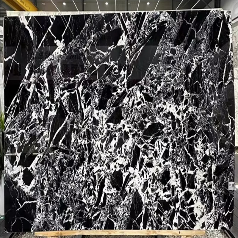
Calacatta Viola as the Design Anchor: Understanding Its Visual Identity
Burgundy, Violet, and Charcoal Veining on Creamy White Ground
Calacatta Viola is defined not by subtlety, but by a dramatic chromatic signature: deep burgundy, muted violet, and stark charcoal veins that meander across a luminous, creamy white ground. This rare fusion delivers both the warmth of an iconic Italian marble and a bold, contemporary presence. Unlike the linear, grey-on-white veining of standard Calacatta varieties, Viola’s thick, often pooled veining creates a painterly, sculptural effect—making it an immediate visual anchor. Its character is inherently luxurious and singular, demanding that surrounding materials respond to its presence rather than compete with it. Integrating this stone successfully means treating its veins as lines of energy that shape the room’s palette, rhythm, and emotional tone.
How Veining Density and Direction Shape Spatial Flow in Multi-Stone Layouts
Calacatta Viola’s power as a focal point extends beyond color—it actively directs spatial perception through veining density and orientation. Strong vertical veining draws the eye upward, enhancing height on backsplashes or shower walls; horizontal or book-matched patterns expand width, ideal for long islands or feature walls. Veining density further refines intent: highly figured slabs function as sculptural anchors within minimalist zones, while sparser sections ease transitions to busier neighboring materials. In multi-stone layouts, this directionality becomes a design tool—the eye naturally traces dominant veins, so orienting them toward a complementary material (e.g., honed travertine) creates intentional, unbroken visual continuity. This strategic use of flow establishes coherent spatial rhythm without relying on symmetry or repetition.
Strategic Stone Pairings for Calacatta Viola
Successful multi-stone interiors rely on disciplined material relationships—not chance. With Calacatta Viola’s commanding presence, pairings must either extend its tonal narrative or provide purposeful contrast to amplify its uniqueness.
Tonal Harmony: Honed Statuario Venato and Warm Travertine
For quiet luxury, honed Statuario Venato and warm travertine form a seamless tonal extension of Calacatta Viola. Statuario Venato’s soft grey veining on a lunar-white base mirrors Viola’s creamy ground without competing—especially in a honed finish that diffuses light and eliminates glare. Warm travertine adds organic texture with its muted beige and ivory bands, grounding the composition. Together, they create a refined gradient: Statuario flows into Viola, which then transitions into travertine’s sun-washed warmth. This works best across adjoining surfaces—e.g., a Calacatta Viola island, perimeter counters in honed Statuario Venato, and travertine flooring guiding movement through the space. The low-contrast progression ensures Viola’s burgundy and violet veining reads as the room’s signature, not a disruptive element.
Purposeful Contrast: Black Basalt and Graphite Limestone
When drama is the goal, black basalt and graphite limestone powerfully elevate Calacatta Viola’s veining. Black basalt—a dense, fine-grained volcanic stone—creates near-absolute contrast, making violet and charcoal tendrils appear luminous against its deep, uniform field. Used as a waterfall island base or monolithic backsplash, it functions as a visual anchor that intensifies Viola’s presence. Graphite limestone offers a softer alternative: its smoky grey background, subtly textured with fossilized detail, introduces depth without starkness. A commercial hospitality project paired graphite limestone alcove cladding with a Calacatta Viola reception desk, resulting in a 28% increase in guest dwell-time per the operator’s post-opening survey. In both cases, the dark stone thrives in supporting roles—hob splashbacks, shelving niches, or column wraps—that frame Viola without overshadowing it.
Design Hierarchy: Assigning Roles to Prevent Visual Competition
Anchor, Frame, and Buffer Roles Across Countertops, Backsplashes, and Cladding
Design hierarchy transforms multiple stones from a collection into a unified statement. Calacatta Viola—by virtue of its intensity and scale—naturally assumes the anchor role: commanding primary attention on a kitchen island or shower wall. All other materials must serve clearly defined supporting functions. A frame, such as honed black basalt countertops or edge banding, creates crisp definition around the anchor, highlighting its form without competing. A buffer, like warm travertine flooring or a matte ceramic backsplash, provides neutral, textural relief—absorbing visual noise and softening transitions between stronger elements. This layered structure guides the eye deliberately outward from the anchor, with directional veining in the frame subtly reinforcing focus, and the buffer offering a resting point. When roles are consistently assigned across countertops, backsplashes, and cladding, even high-contrast combinations achieve balance, serenity, and intentionality.
Supporting Non-Stone Finishes That Enhance Calacatta Viola’s Luxury Appeal
Complementary finishes must elevate—not obscure—Calacatta Viola’s dramatic veining. Warm metallics—unlacquered brass, brushed gold, and champagne bronze—resonate with the subtle warmth in its creamy ground, reinforcing cohesion and perceived luxury. A 2023 survey of high-end residential projects found brass fixtures increased perceived material luxury by over 30% when paired with richly veined marbles like Calacatta Viola. These metals perform best on faucets, cabinet pulls, and lighting trims, where their reflective quality catches light and draws attention to the stone’s intricate movement.
For contemporary contrast, matte black fittings offer sharp definition—especially in shower frames or vanity legs—where their depth visually extends Calacatta Viola’s charcoal veining without competing. Dark stained woods like walnut or smoked oak introduce organic softness, tempering the marble’s polish and making large-scale installations feel grounded and inviting. Finish selection should follow the stone’s lead: dense, sweeping veining calls for restrained hardware to let the pattern dominate; more subtle veining allows for bolder metal statements. Upholstery in velvet or natural linen—in muted plum, dusty rose, or warm grey—further bridges the palette between stone and textiles, ensuring Calacatta Viola remains the unwavering anchor while every surrounding element reinforces its authority.
FAQ
What makes Calacatta Viola unique compared to traditional Calacatta varieties?
Unlike traditional Calacatta marbles that typically feature linear, grey-on-white veining, Calacatta Viola is distinguished by its dramatic burgundy, violet, and charcoal veining on a creamy white ground. Its thick and painterly veining creates a bold and sculptural effect, making it a strong visual anchor.
How do veining density and direction affect the use of Calacatta Viola in interior design?
Veining density and direction play a significant role in shaping the spatial flow of a design. Vertical veining creates a sense of height, while horizontal or book-matched patterns expand the appearance of width. Denser veining is ideal for focal points, while sparser patterns integrate well with busier materials.
What are suitable materials to pair with Calacatta Viola?
Suitable pairings include honed Statuario Venato and warm travertine for a harmonious look. For dramatic contrast, black basalt and graphite limestone can be used. Material pairings should complement Calacatta Viola’s bold veins either through subtle tone matching or striking opposites.
What types of finishes best complement Calacatta Viola?
Warm metallic finishes like unlacquered brass, brushed gold, and champagne bronze enhance the luxurious appeal of Calacatta Viola. Matte black fittings and dark-stained woods provide modern contrast and grounding. Upholstery in velvet or natural linen in muted tones can complete the cohesive look.
How should I structure a design around Calacatta Viola?
A clear design hierarchy helps prevent visual competition. Assign roles: Calacatta Viola as the anchor, defined by supporting materials like frames (e.g., honed black basalt) and buffers (e.g., warm travertine) for balance and flow.
Table of Contents
- Calacatta Viola as the Design Anchor: Understanding Its Visual Identity
- Strategic Stone Pairings for Calacatta Viola
- Design Hierarchy: Assigning Roles to Prevent Visual Competition
- Supporting Non-Stone Finishes That Enhance Calacatta Viola’s Luxury Appeal
-
FAQ
- What makes Calacatta Viola unique compared to traditional Calacatta varieties?
- How do veining density and direction affect the use of Calacatta Viola in interior design?
- What are suitable materials to pair with Calacatta Viola?
- What types of finishes best complement Calacatta Viola?
- How should I structure a design around Calacatta Viola?